Overview
About Client
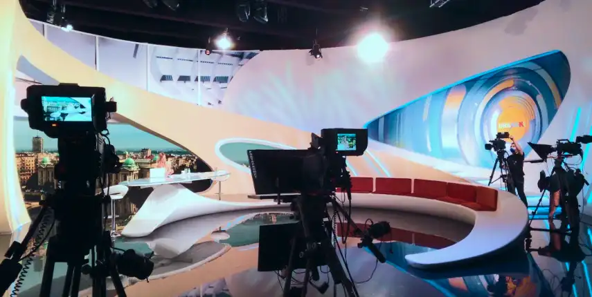
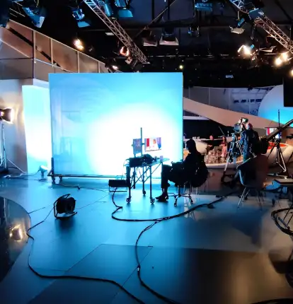
Minacord Media is a Serbian media company. The company manages several TV channels, K1, Kazbuka, TV Doctor, and Tanjug. These channels are transmitted via cable and IPTV in Serbia and on the Go4TV mobile platform across various European countries, the USA, and Canada.
K1
About
K1 is the flagship channel of the Minacord network in Serbia,
offering a diverse range of programming that includes
entertainment, reality shows, and lifestyle content.
Known for its engaging local and international shows, K1
focuses on real-life stories and cultural themes, making it a
popular choice for viewers seeking relatable and entertaining
content.

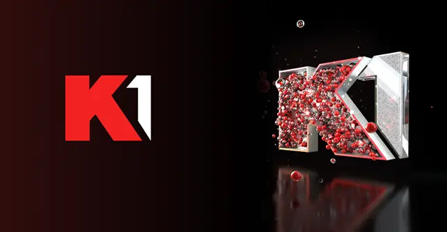
Exploration 01
The first iteration focused on a more 2D aesthetic, with slight leanings toward a 2.5D effect.
The color palette featured varied tones to create visual depth and vibrancy.
The design targeted a younger audience,
emphasizing themes of music and entertainment to capture energy and excitement.
Exploration 02
In this version, the client requested a complete shift in direction.
The goal was to create a more commercial look with the flexibility to expand beyond entertainment and music.
The design featured shiny spheres, which formed the foundation of the K1 logotype. This approach was extended to the rest of the broadcast materials,
maintaining a cohesive visual language rooted in the same physical concept.
Final
After the second exploration, we applied the solution across all media materials.
The updated approach ensures consistency and clarity in every format.
This adoption streamlined the design process, improving scalability and visual impact while maintaining a cohesive look.
Kazbuka
About
Kazbuka TV is one of the channels developed by Minacord Media, primarily targeting a younger audience.
The channel aims to blend educational and entertaining content
to engage children and teenagers.

Exploration
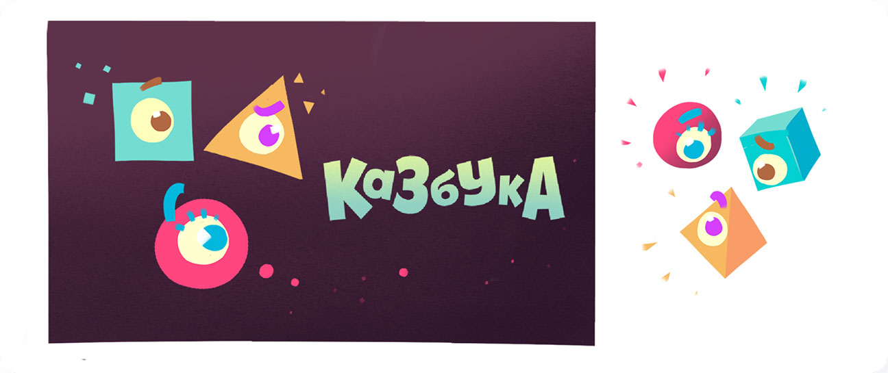
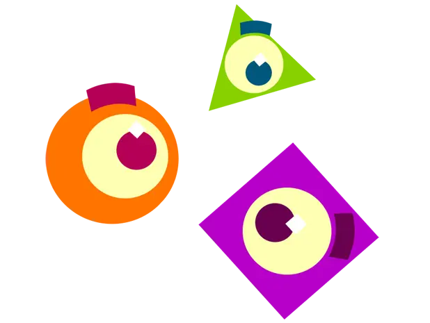
We conducted R&D to develop a concept using basic shapes like triangles,
cubes, and circles, making them familiar and recognizable to younger audiences.
By adding eyes and unique personalities to each shape, we
aimed to create a personalized and engaging experience for
children.
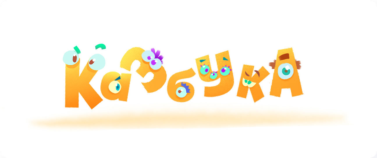
Final
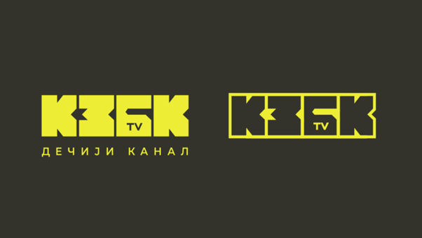
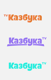
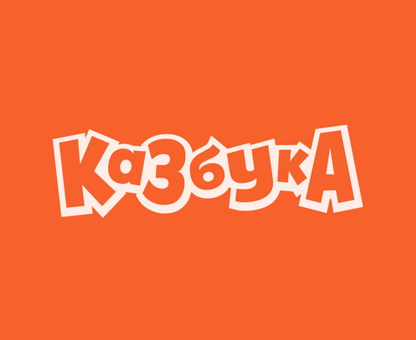
The design process produced clearer, flattened shapes that feel simple and modern.
This streamlined look improves clarity and works seamlessly across formats.
Simplified forms ensure versatility and timeless appeal.
Reduced detail enhances readability and balance without losing impact.
TVDR
About
The channel often features expert advice, medical news, health tips, documentaries, and educational shows aimed at promoting healthy living and increasing
awareness about various medical conditions and treatments.
TV DR serves as a valuable resource for viewers interested in
maintaining their health and staying informed about medical
advancements and health-related issues.

Exploration
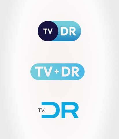
The TV DR logo features a pill-like shape, symbolizing the
channel’s commitment to health and wellness. The blue contrast
tones convey trust and professionalism, appealing to viewers
seeking reliable medical information.
This design effectively communicates TV DR’s mission to
educate and empower audiences on health-related topics and
advancements.

Design: Filip Mikic / Dusan Popovic / Janko Pjesivac / Ivan Stojkovic
Motion Graphics: Janko Pjesivac / Ivan Stojkovic
Illustrations: Ivan Stojkovic

